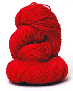
 Red is a very intense color with high viability. It is a warm, energetic color that reflects strength, health, & energy. Red represents joy, passion, sexuality, willpower, courage, & anger.
People who prefer red are often outgoing, & energetic individuals who embrace life with passion. They have a positive outlook on life, & do not like to be bored. Quiet people with a preference for red, may feel the need for the warmth, strength & life-giving qualities of the color. Red is a color chosen by men, women, & children alike.
What colors go with red?
Red is a bold color that makes a nice splash to a neutral pallet.
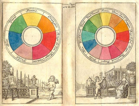
Red is the opposite of green on the color wheel.
A light tint of blue creates a nice contrast.
. . . . . . . . . . . . . .
 Orange is a warm color that combines the energy of red with the happiness of yellow. It is associated with joy, sunshine, happiness, & creativity. It has an invigorating effect that stimulates mental activity.
Orange is preferred by flamboyant, fun-loving people, & is highly accepted by youth.
What colors go with orange?
Red & yellow can be paired well with orange.
Blue is the opposite color of orange on the color wheel.
. . . . . . . . . . . . . .
 Yellow, the warm color of sunshine, inspires joy & happiness. It arouses cheerfulness & stimulates mental activity. Men often perceive yellow as a color for lighthearted children.
People who prefer yellow are those who are mentally adventurous. They are clear precise thinkers who have lofty ideas & may at times shun responsibility preferring freedom of thought & action.
What colors go with yellow?
Yellow tends to disappear into white, so it usually needs a dark color to highlight it such as brown.
It pairs well with orange or green.
It is opposite of violet on the color wheel.
. . . . . . . . . . . . . .
 Green is the color of nature. It symbolizes growth, harmony, & freshness. Green is the most restful color to the human eye.
Green is the choice of gentle sincere people who are often frank. They are community-minded people who can be fairly sociable, but prefer peace at any price.
What colors go with green?
Green is a cool color that goes will with yellow or blue.
Red is the opposite color of green on the color wheel.
. . . . . . . . . . . . . .
 Blue is the color of sky & sea. It is often associated with depth, stability & tranquility. It symbolizes trust, loyalty, wisdom, confidence, faith, & trust. Blue is considered beneficial to body & mind by producing a calming effect.
Blue is most preferred most by males.
What colors go with blue?
Blue is a cool color that sets opposite of orange on the color wheel.
It goes well with green or violet.
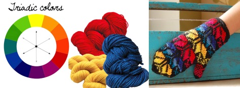
When blue is used with warm colors like yellow, & red, it can have a strong visual impact.
. . . . . . . . . . . . . .
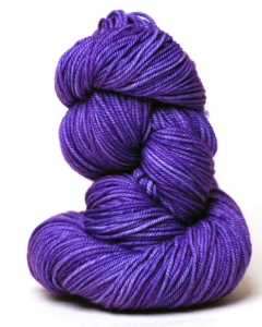
Violet is a cool color that combines the stability of blue with the energy of red. It is associated with royalty, wisdom, dignity, creativity, mystery, & magic. It symbolizes power, luxury, & ambition.
Violet is often preferred by women & children.
Light purple evokes romantic & nostalgic feelings, while dark purple evokes gloom & sadness.
What colors go with violet?
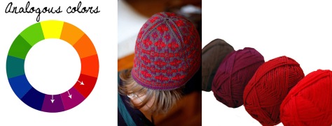
Blue is a great color to combine with purple, or red can be used for a vibrant contrast.
Violet sets opposite of yellow on the color wheel.


